Group strips look weird alone

A group that had one strip inside it looked very weird
image

while this is what it’s supposed to look like
image

but it needs to overlap with something for that to happen

What problem(s) would this feature resolve?

Visually it would be better to look at and also

How does this feature fit in Bitwig as a product?

It’s a visual fix.

Is there already an alternative way to achieve this on Bitwig?

Don’t think so…

Could it be provided by a VST or something else reasonably integrated with Bitwig?

Don’t think so…

After replicating this “setup”, I actually believe that the current status is better then your proposal.

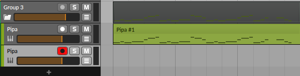
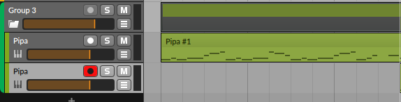
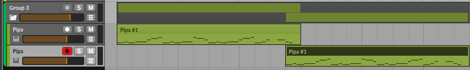
If, for whatever reason, a Group only has content in one track, Bitwig shows its content “inside” (hence the shadow). This is more information than showing one or more strips.

This makes more sense when the Group is grouped, and the tracks inside are not visible.

This topic was automatically closed 14 days after the last reply. New replies are no longer allowed.